Download a free copy of our exclusive Voter-Info Newsletter – containing articles and information that all voters need to know. In this most recent 2026 (Revised) edition, we cover the following issues:
Detailed numbers are provided of the “New Voter” at the level of National, State (NC), and a sampling of 10 NC counties.
Describes exactly what is happening to our elections as the result of Early Voting and the No-Excuse Absentee Ballot. And answers that all important question,
“Why Democrats are One MILLION Votes off their Trend Line in North Carolina???”
Republican and Democrat Voter Participation Rate (VPR) Charts for North Carolina and Nation, with supporting data.
How the Democrats are abusing the Absentee Ballot for the 2026 Primary Elections.
Billy Parker’s mission is to discover and disclose the TRUTH about what is happening to our Elections. Won’t you help too?
Link Candidates to Education about “How Our Elections Have Changed.”

Specific Examples of How Early Voting and No-Excuse Absentee Ballot are being abused and 2 state agencies believed to be in on the “scheme.” And should WE not be questioning the role of government in our elections?
Letter dated April 28, 2026 to EVERY Republican Member of the NC General Assembly detailing how the Republican Establishment have attempted to stop me from getting this most important message out about what is happening to our elections. And letter dated May 12, 2026 to Jason Simmons, Chairman of the NC GOP detailing the deep dark secret of what is believe to be the Republican Establishment and how they don’t want you to know how Early Voting and No-Excuse Absentee Ballot are altering our elections.
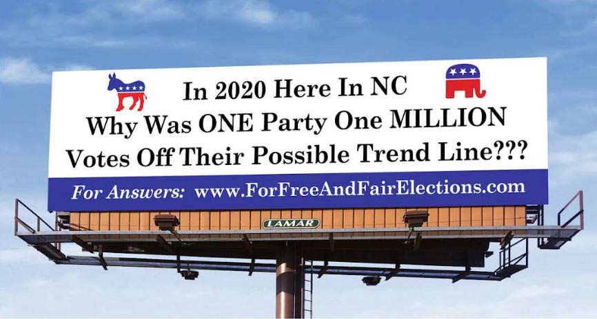
It is absolutely crucial that WE get the word out about what is really happening to our elections. Finally, we have the numbers to prove something very unusual is in fact happening. Please help me to fundraise to put up highway billboards.
Overall Theme of Website: Voters are a sub-set of the population; therefore, they should be measured in terms of the population – for proper and accurate election analysis. This is best accomplished with the use of the Voter Participation Rate (VPR).


Over a five (5) decade period (from 1952 to 2000) the Voter Participation Rate (VPR) was between 36.9% to 39.4% (Nationally) – a 2.5% range, and our elections looked to varying degrees like the examples shown on the left under “Elections THEN.” The political pendulum might not have swung as far to the right or to the left as shown with the two examples of 1964 and 1984, but what they all had in common was nearly the same percentage of the population voted in every election cycle. This was a period where both of the two major parties did everything, within legal limits, to get the vote out and encourage everyone to vote. If either one of the two parties ran at least an average candidate, the voter participation was within this 2.5% range of the population. There were vigorous campaigns during this period involving many good to excellent candidates; but 39.4% of the population was the maximum level of voter participation that was possible (with a two-man race). Only with the third-party candidacy of Ross Perot in 1992 was there enough enthusiasm to increase this up to 40.9%
Then with the 2004 national election, this all started to change, as shown with the (national) example on the right. While the change from THEN to NOW was gradual in the beginning, the majority of this change happened in one election cycle – that of 2020. Now the VPR on a national level is way up to 47.8% (rounded up).
For North Carolina, the VPR has traditionally been 39% or below; now it is way – way up to 52.9% (rounded down). And notice in the last frame how the percentage of “New” Democrat voters outnumbers the “New” Republican voters by an astonishing 2 to 1 ratio. This certainly should warrant an investigation and possibly election audit.
For further explanation of the Voter Participation Rate (VPR) and the historical percentages on a national level for the past 75 years, see the 4-page article entitled “23%, 6.4%, 41% – Percentages You Need to Know If an Election is Fraudulent,” published April 3 rd 2022. This research analysis serves as the basis for explaining, “What is Happening to Our Elections?” For a FREE Download of this 4-page article, click onto the button below
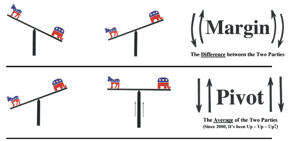
The Margin & Pivot Approach is based upon the two analogies of the Political Pendulum and Political Seesaw.

There are actually three (3) different methods of calculating the Voter Participation Rate (VPR).

When discussing the Voter Participation Rate (VPR), there are often four questions that repeatedly come up.

We all have a tendency of wanting to compare one election cycle to another. But there’s one little problem, the population keeps changing with increasing (and possibly decreasing) numbers. With any high degree of reliability, it’s nearly impossible to compare the election result numbers for the election cycle of 2020 to say that of the 2000 cycle or even 1960 – because the population is completely different. It’s like comparing apples to oranges.
BUT comparing the voting level of the total population for one cycle to another, now that is a different animal all together. By dividing the number of votes cast (the election results) by the population (the Census numbers), you automatically adjust for increases and decreases in the population from one election cycle to another. We call this method of calculating the level of voting, the “Voter Participation Rate” or simply the “VPR.” By this method, you are then able to compare one cycle to another with a much more degree of reliability and compatibility. For instance, the total level of voting in the United States for 2020 was at 47.8% of total population; for 2016 it was at 42.4%; for 2000 it was at 37.5%; and for 1960 it was at 38.4%. This thus becomes a comparison of apples to apples! Therefore and in performing regression analysis of historical election cycles, we believe the best method is by the VPR.
We believe regression analysis of election results involving the Voter Participation Rate (VPR) represents a major breakthrough development in the field of election analysis. We now have a true comparison means to analyze multiple election cycles to one another and over time. And we are much better able to measure what is known as the “Out-of-Line bloc of votes – according to historical trends and margins.” (See below for a further description of this voting bloc.) Before, it was like feeling our way around in the dark, as with the Margin and Pivot Approach; but now, it is like the light has been turned on with the Regression Analysis Approach, with us being able to see things much more clearly now.
This amazing discovery is the combined efforts of Dr. Stan Young, a professor of statistics, and Billy Parker, both of Raleigh, NC. Mr. Parker had spent 2 ½ years compiling and reorganizing – putting in sequential order U.S. Official data, that of election results and the U.S. Census for the nation and the 50 states going back for the past 75 years – a period known as the Modern Era of American Politics.
While one is able to download election results from the Internet, it is always for a single election cycle, usually for the nation and all 50 states. But one is NOT able to find this data in sequential order, for numerous election cycles in a row, for just the nation or any particular state, in order for the results to show a trend. And if one was lucky enough to find such information, one would highly unlikely be able to find this data along with the census population for those cycles. Thus there was a need to create a new data bank – one that actually makes sense and shows a trend. As one can imagine, this can be a very tedious and time-consuming process for reorganizing such data.
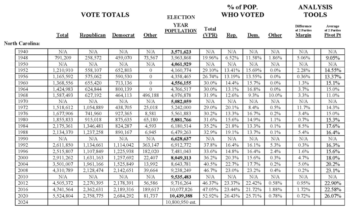
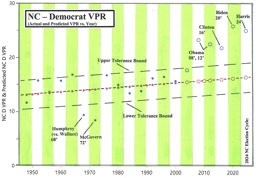
Above is the table Mr. Parker came up with for the state of North Carolina. It is divided into basically three different sections. The first are the actual vote totals for the office of President for each General Election cycle going back to 1948. The next (middle) section is the population count for those cycles, with the bold print being the actual U.S. Census figures and the others being estimated by the commonly used method of Interpolation. Then for the third section, that is where the vote totals are divided by the population count, in order to get a percentage of the population who voted – the level of voting for each cycle by the total vote and the individual parties. This section of VPRs is very important for two main reasons. The mind is much more able to conceive data expressed as a percentage than some large number. And the VPR is automatically adjusted for increases and decreases in the population.
Mr. Parker went to Dr. Young to see how the data from the table could be statistically plotted out, in order to create a visual representation of the numbers. Dr. Young recognized that the data from each column would be best expressed in a form of a regression analysis, with the following math formula serving as the basis for the regression.
Y = a + bX
Go to Download for more information on:
Initially, Dr. Young did a regression analysis of the Total Vote – that of the first column. Below is that very first chart, showing the un-filtered raw data (without any Overlays).
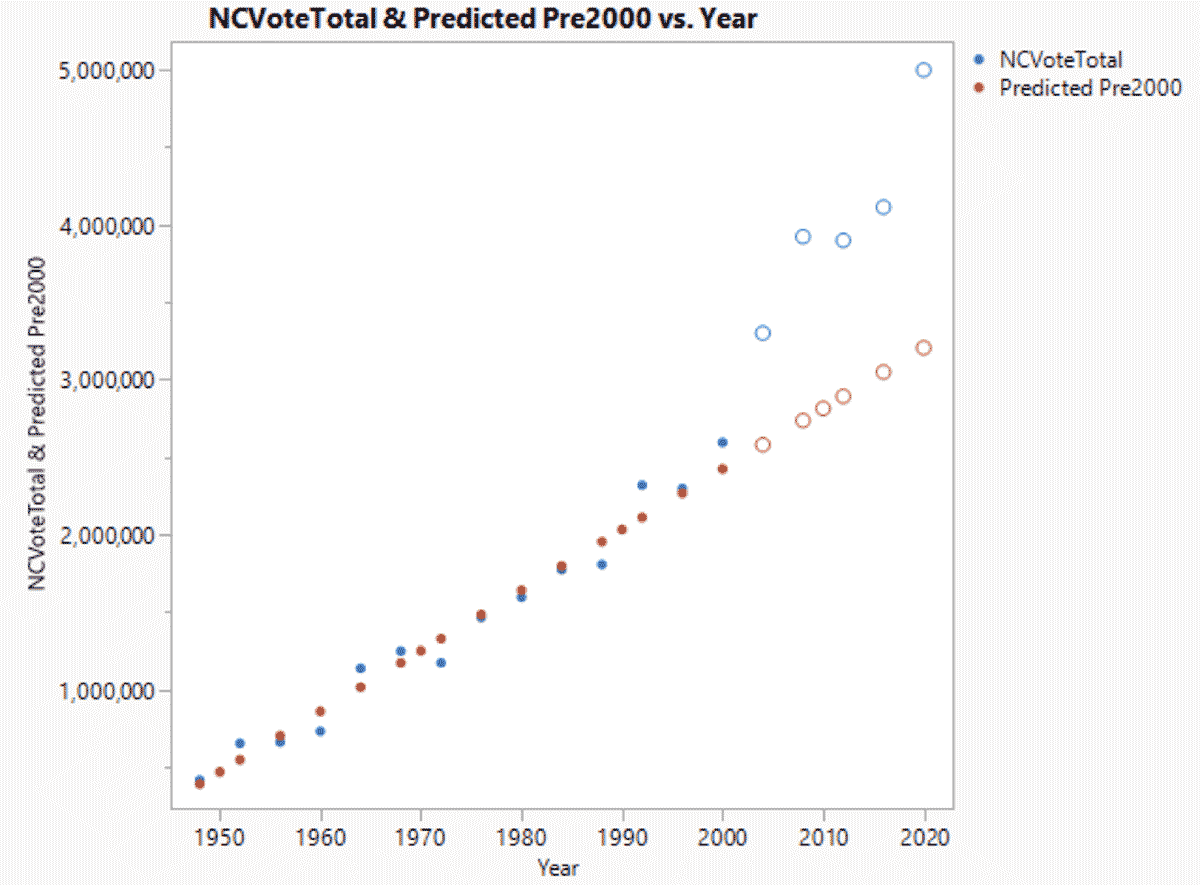
The results of this data from this very first chart were no less than breathtaking – incredible. Note that from 2000 to 2020, the number of ballots cast nearly doubled; but during this same period, the population for North Carolina (not shown on this chart) went up by only 29.69%. So what’s going on here?
After doing this initial chart, Dr. Young and Mr. Parker soon realized the data was skewed for the fact that it didn’t take into account the constant increases in population from cycle to cycle. That is when Dr. Young produced the regression charts using the VPRs – a better method of analyzing the data. Later, Mr. Parker added the Overlays, as exhibited with the charts below.
Now, one is able to see, in crystal clear focus, precisely when and where anomalies have occurred, and where our elections have been altered and manipulated in recent cycles. By combining the Voter Participation Rate (VPR) with Regression Analysis, a new and much better methodology of analyzing election results was born!


All the Voter Participation Rate (VPR) charts show the actual VRP versus year, which are expressed with the Blue Dots and Circles. The charts for the Total, Republican, and Democrat VPR all show a Linear Regression of the data points (based on the actual VPRs) from 1948 up to 2000, with projection to 2020. This Linear Regression – the Predicted VPRs are expressed on the charts with Red Dots and Circles; and they are the basis for forming the Long-term trend of the respective category of type of votes. Most states have positive or slightly positive long-term trend lines; but a few actually have a negative trend. The Tolerance Bounds are two equal-distance parallel lines to this center trend line, where most election results fall within these bounds. “Tolerance Bound” is a technical term and is roughly comparable to +/- 1.5 standard deviations; and if a VPR is outside of the Tolerance Bounds, then it is considered a statistical Outlier. Note that a Statistical Outlier makes no value judgment as to the cause of unusualness; it points to observations that should be evaluated. (For a further detailed explanation of Tolerance Bounds, see the 1947 paper written by Professor John W. Tukey of Princeton University.)
For purpose of these initial charts, the Tolerance Bounds are subjectively drawn-in equal-distance lines encompassing the majority of the data points – for most charts, this is usually from 73.7% (14 ÷ 19) to 84.2% (16 ÷ 19) of the election cycle data points.
Whenever a VPR data point is on or slightly outside of the Tolerance Bounds, this usually means, as with the Total VPR charts, that it was a very enthusiast campaign season if it is with the Upper Tolerance, and a lackluster campaign if it is with the Lower Tolerance; and with the individual party VPR charts, then it would mean that their party candidate did very well (if on or slightly above the Upper Tolerance) or did very poorly (if on or slightly below the Lower Tolerance). For instance, in the 1948 election cycle, the VPR data point involving the total vote is at or slightly below the Lower Tolerance Bound. This can be easily explained because it was generally a lackluster campaign election cycle, with many people in both political parties just not showing up to the polls on Election day. The opposite happened with the 1992 election cycle where Ross Perot ran the first time as a major third-party candidate. With the Total VPR chart – Republican, Democrat, and 3 rd Parties combine (representing only the total level of voting and not the individual party vote), we see on the national and state level across the nation for 1992 that the VPR data point is at or above the Upper Tolerance Bound. While Ross Perot mostly took votes away from the Republicans, he did, however, energize the campaign that year by bringing in new voters and have them to participate in the election process, many for the first time. This caused the level of voting by the public to be at a historic high for that election cycle – which is clearly expressed on the charts.
Whenever there is a HUGE outlier, however, going far outside the Tolerance Bound, then that is very rare, and there should be a good and easy explanation for it. A classic example of a huge outlier is what happened in Arizona on Election Day in 2000. If one will remember, that was the year during the Primary season, where George W. Bush smeared John McCain; and with McCain being Arizona’s “Favorite Son,” then many of the people (of both parties) of that state “sat out” the General Election – all of which are expressed on the Total, Republican, and even Democrat VPR charts for that state. There is a bit of a mystery, however, when it comes, to the Outliers for 2020 and even 2016 for certain states. There seems to be NO good and easy explanation for what happened especially for 2020 – which opens the door to the possibilities of being caused by nefarious activities of one or both political parties, or by other possible forces that are effecting our elections. With this said, the following should be noted also: These regression analysis charts do NOT prove election fraud; but rather, they only prove the possible unusualness of an election cycle, and there could be any number of reasons for this unusualness, including but not limited to a candidate doing very well or poorly on one hand; and on the other hand, it might be the result of nefarious activities by one or both of the two major political parties. There is a separation from knowing the cause and the observation of the unusualness. Tolerance Bounds used are only drawn-in lines to help give some visual guidance. Only a full forensic audit can prove and/or show election fraud; although, statistic tools as regression analysis can point to the strong need for such an audit.
Comments on outliers (in no particular order):
The evaluation of outliers has a long history; one is a book by Doug Hawkins, 1980. Randomness can give rise to an extreme value. There may be some cause that leads to an extreme value, e.g. 3 rd party voting is high. There is “masking” and “swamping”. You need an honest estimate of the variability of the data. Swamping is too many caused extreme values that inflate an estimate of the variability. Masking is a random observation a bit bigger than a caused outlier. We are into “arts and crafts”. A tolerance bound is a bound that includes a named proportion of the data with a fixed probability.
There are other ways to judge the after 2000 vote totals. For example, are they all above the regression line? If so, then perhaps something has changed. The change may not be nefarious, but it could be. Does something look odd? In the real world of accounting, there is the labor intensive forensic audit. John Droz, Jr. found only 3 for 2020. They all failed.
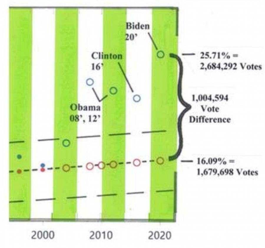
The problem we are finding with elections is the large number of votes outside of what is considered the historical trend and margins. Using regression analysis of the Voter Participation Rate (VPR), the “Vote Difference” is simply the difference in the actual and predicted VPR multiplied by the population for a particular election cycle. This “Vote Difference” is expressed on the upper right side of the charts (involving overlays) as a vote total number. Nearly all election cycles have a Vote Difference off the Linear Regression (trend line), either positive or
negative to the trend; but they are usually within the Tolerance Bounds. And all elections, if they are not on the Linear Regression (the trend line), are out-of-line to a certain extent. It is only when they are way out-of-line and beyond the Tolerance Bound should there be serious questions asked as to why. This is considered unusual and may indicate an anomaly. Going beyond this tolerance to the point of the Outlier, we call this difference an “Out-of-Line Vote - according to Historical Trends and Margins.” The degree of deviation can be figured relative to the Regression Line (typical) or (more conservatively to) the Tolerance Line.
The Out-of-Line Vote does not necessarily mean a “Fraudulent Vote;” but the “Fraudulent Vote” almost surely makes up part of the “Out-of-Line” bloc of Votes. There are at least eight (8) identified forces that are causing this new bloc of votes that are altering and manipulating our elections in recent cycles; those eight include: The Government, Political Parties, Nonprofit NGOs, Changes in Population/Demographics, Media and Big Tech, Immigration (both Legal and Illegal), Public-Private Partnerships, and Advancement in Technology. Some of these forces are totally legitimate such as (Legal) Immigration and Advancement in Technology. But there are other forces that represent bad actors in our election system, such as some of the Nonprofit NGOs (Non-Governmental Organizations) and some of the Big Tech companies, also Big Tech and Government collusion. When adding up the effect of all these various forces, it represents what is causing much of the current “Vote Difference” and/or the “Out-of-Line” bloc of Votes.
It should be noted, however, that any amount of “Vote Difference” off of the Linear Regression is technically an “Out-of-Line” vote (according to historical trends and margins); and it can be for a variety of reasons as referenced above. One can expect any election to be a little out-of-line – off of the trend line, creating some type of “Vote Difference” for an election cycle. In fact, if elections were all on the Regression Line, without any deviations, then that would be an anomaly in of itself. It’s just that one should question, where does normal end and abnormal begin? We try to answer this with the Tolerance Bounds.
Well, it depends upon your definition of “stolen” and which state is in question. Every state is somewhat different, but I can attest for here in NC that our elections have been greatly altered and manipulated in recent election cycles. For the 2020 General Election in NC, we can plainly see through the regression analysis charts for the Total VPR that there was a 1.2 Million “Vote Difference” – much of which can be described as an “Out-of-Line” bloc of voters – according to historical trends and margins.
First of all, I do NOT believe the problem was with the voting machines and hacking into the voting systems, at least here in North Carolina. And while there were actual cases of this happening around the country, which may have affected some local elections in other states (an example is Antrim County, MI), I personally don’t believe this method of cheating rose to any statistical significance on a national level.
For states that used ballot drop-boxes, there was a serious problem with them being stuffed with very questionable votes (Source: “2000 Mules”). But for North Carolina (which does not use drop-boxes), the problem seems to be with other types of vote harvesting schemes. The Democrat Party used (and abused) the One-Stop Voting, Early Voting, the No-Excuse Absentee Ballots, and the No Picture IDs* in an attempt to “steal” the election. They almost succeeded in “stealing” the presidential race; but I believe they actually pulled it off with the governor’s race, and possibly the attorney general’s race as well.
During Early Voting in NC, the Democrats were able to empty out the Homeless Camps, in order to round up people by the bus load to take to the One-Stop Voting sites. When you spread out the time to vote (like with several weeks), you give time for the cheaters to cheat. Since Homeless Camps are mainly found in metropolitan areas, these areas (not rural counties) show a major shift in voting patterns. The Democrats also took other segments of the population, like with senior centers, by the bus load to the One-Stop Voting sites during the Early Voting period as well.
Also in many of these Metropolitan areas with major university campuses, the Democrats have registration drives of college students. After these students graduate and/or move away, they are often left still on the voter rolls. The Democrats are then able to use these registrations to cheat. This is another reason why picture ID is so crucial in order for fair elections.
The Democrats took similar tactic actions with the elderly and the mentally challenged with the use of the No-Excuse Absentee Ballots during the Early Voting period. They were able to go to the nursing homes to gather up Absentee Ballots from people who are commentosed and/or have dementia – people who have no business voting.
Here in North Carolina during the 2020 General Election, the Democrats also went after the very low-information voter. There were roughly 190,000 (out of 5.5 Million) ballots cast in that election where the voter checked the names of candidates for only one (1) to five (5) elected offices. These people were so lazy, afraid (possibly voting under duress and pressure), and/or uninformed that they couldn’t even fill out the rest of the ballot – even with those races that had an “R” or “D” beside the names. I wonder how many of these represented the mentally-challenged and/or homeless population???
With a high probability, it is estimated that there were around 100,000** votes cast where people went and voted in other people’s names during the Early Voting period. Because we had No Picture ID required for voting at the time, the Democrats were able to get away with this type of fraud. Very close to this category of questionable votes are those people who are registered in multiple counties. This may include people who own property in more than one county, and thus are on both the tax and voter rolls in those multiple counties. This type of voter fraud also includes people who moved from one county to another, but are still on the rolls of their former county of residence. And of course, this type of fraud includes those who just falsely and illegally register in more than one county (sometimes not using the exact same name), no matter if they own or had owned real property in those counties. These are examples of how coordination from the very top and individual Democrats – the lone wolves often cheat in our elections.
And how about all the non-citizens who are able to obtain a driver license, with many of them taking the next step of also illegally registering to vote? There is no doubt that non-citizens are affecting our elections. When asked about this recently, Jim Womack who heads up the North Carolina Election Integrity Teams (NCEIT.org) and who has worked tirelessly in cleaning up the voter rolls had this to say: “There are indeed non-citizens being ‘accidentally’ added to the voter registration list in NC. This occurs primarily by poor quality controls at State DMV offices, principally when being issued driver’s licenses. S747 provides a means of cyclically identifying some of them for removal (when they are called for jury duty and refuse because of non-citizen status). However this fails to remove the majority of non-citizens.”
No one knows for sure the exact number of votes cast by illegal immigrants in our elections. But with surveys done of the question, we can get some type of estimate. Just Facts, an independent New Jersey research organization, released the results of a study back in June of 2017 of the 2008 Presidential Election. Using extensive data from a Harvard/YouGov study of tens of thousands of voters, Just Facts “estimated that as many as 7.9 million non-citizens were illegally registered to vote in 2008.” And while the study provided a rather wide range, the number of actual votes affected could have been as high as 5.7 million.
Historically, only about 60% of registered voters actually show up to vote. So if 7.9 million non-citizens are illegally registered, then that would have translated as being 3.61% of the Total Vote being cast by illegal immigrants. If that percentage for 2008 on a national level held true for North Carolina in 2020, then that works out to possibly 199,445 (3.61% x 5,524,804) illegal votes by non-citizens for the state.
So you decide for yourself if the election was “stolen.” Again, the regression analysis, based upon official government data, shows there was a 1.2 Million “Vote Difference” – much of which was an “Out-of-Line” bloc of votes in NC for the 2020 election. And if it wasn’t “stolen,” then the Democrats definitely were trying. With the election result being so far off the trend line, it appears (perhaps obvious) that something very unusual indeed happened.
We must go back to only Precinct Voting and one-day Election Day voting, and that would solve 90% of the problem with election integrity. While the Democrats will still attempt to cheat on Election Day, the time element won’t be in their favor if we make these changes.
Billy Parker
Article written 10/30/2023
* With the recent changes of election law by the NC General Assembly and changes with the state Supreme Court, the No Picture IDs as a method of voter fraud has effectively been taken off the table for the Democrats.
** It is believed that there was a cover-up by Governor Roy Cooper’s (D) State Board of Election in their reporting of voter fraud cases – with only 358 reported cases being filed, with 61 of which having been referred to a district attorney for prosecution (out of a state of 10.4 Million people). When the public citizenry reported cases of election fraud to the board, it is believed a partisan blind-eye was often turned and very little follow-up work was done by the state in order to suppress the true number cases of voter fraud.
And the Democrats are Doing this with Certain Segments of the Population, including the Elderly, Mentally-Challenged, Homeless Population, Illegal Immigrants, and the Very Low Information Voter (just to name a few).
OTHER AVAILABLE CHARTS and for OTHER STATES: Go to our new Regression Analysis Election Charts Web Page for additional charts and analysis for NC and for OTHER STATES. Each state has a link to the data used for the regression analysis.
At this time, only a few states are loaded. As time and resources permit, we will be constantly loading more and more states until all 50 are published. Sorry for this inconvenience and time delay.

PDF Download of ALL available Election Charts
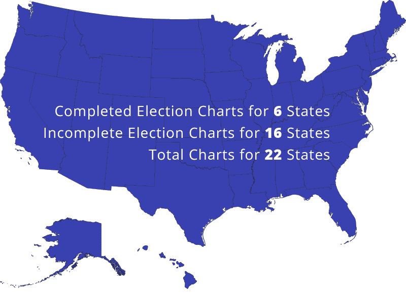
“Because there is a tremendous need to understand what happened in 2020, we are exhibiting the
charts on all twenty-two (22) states where we have complete or partial charting information.”
(Print on Legal Size Paper)
Rebecca Terrell of “The New American” interviews Billy Parker – showing statistical proof that our elections have become Altered and Manipulated. And learn about the Eight (8) Forces causing this change.